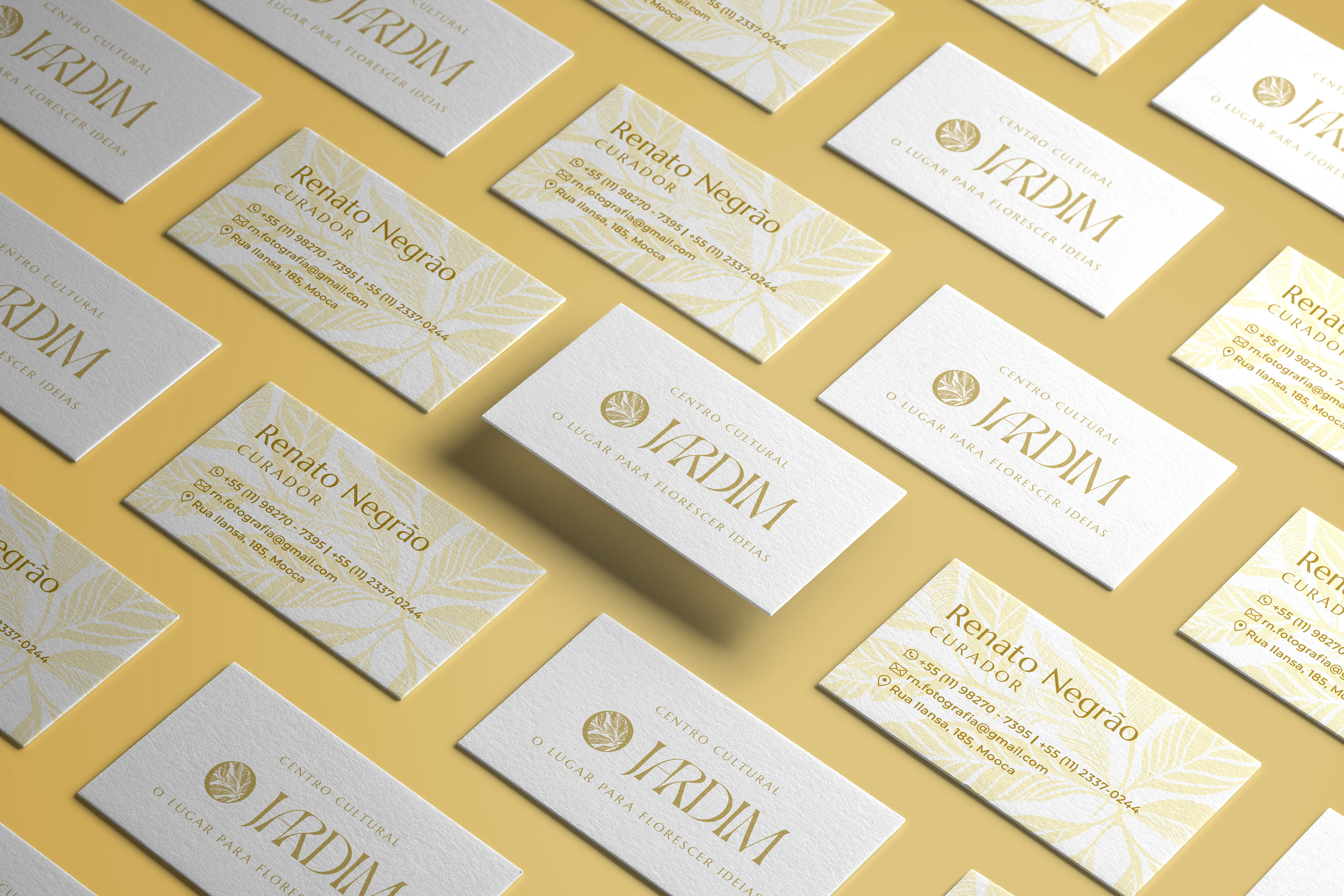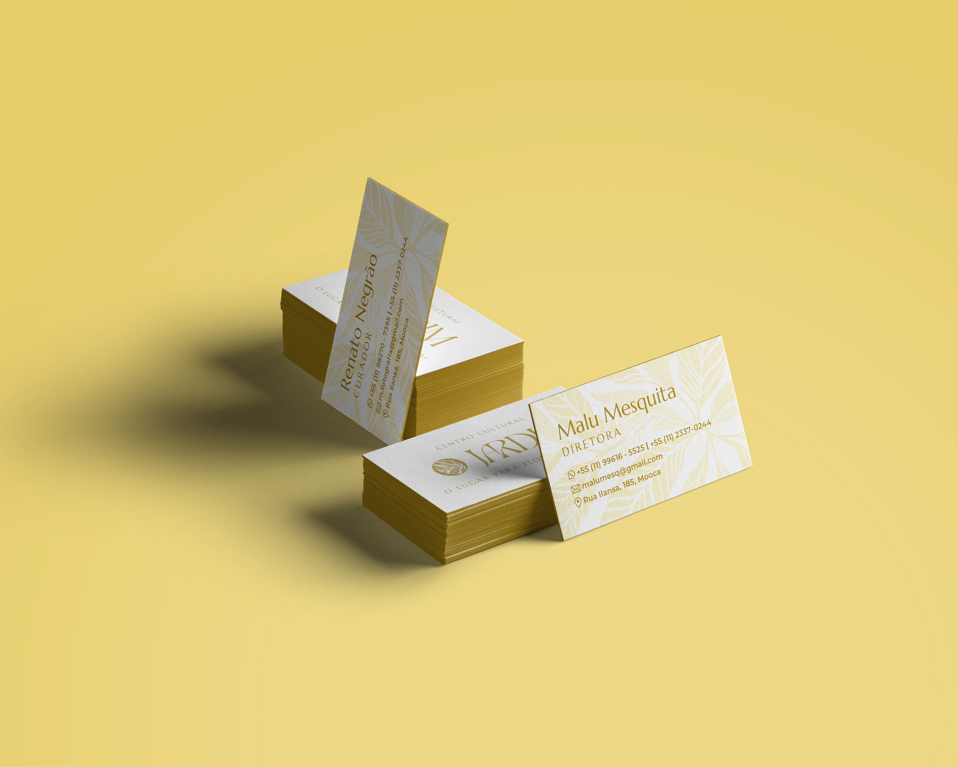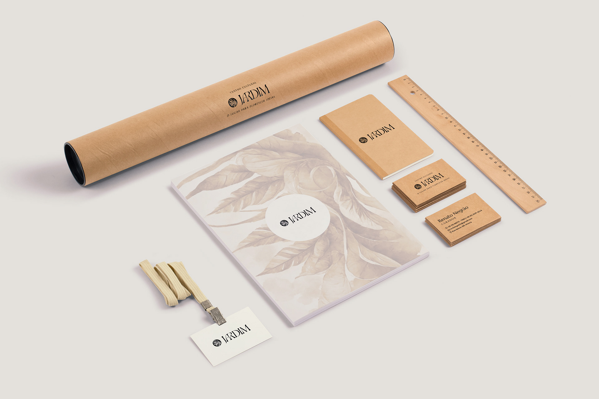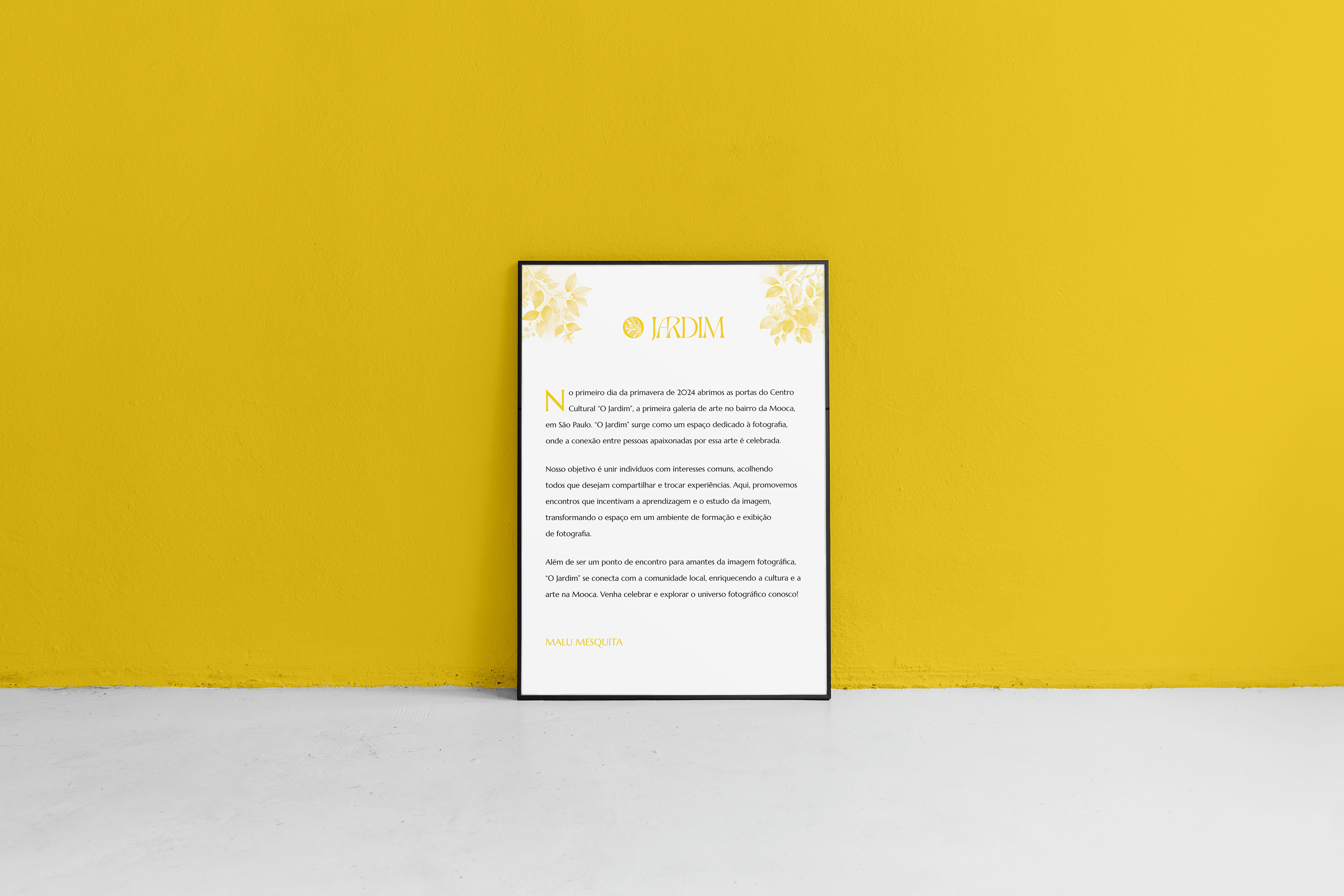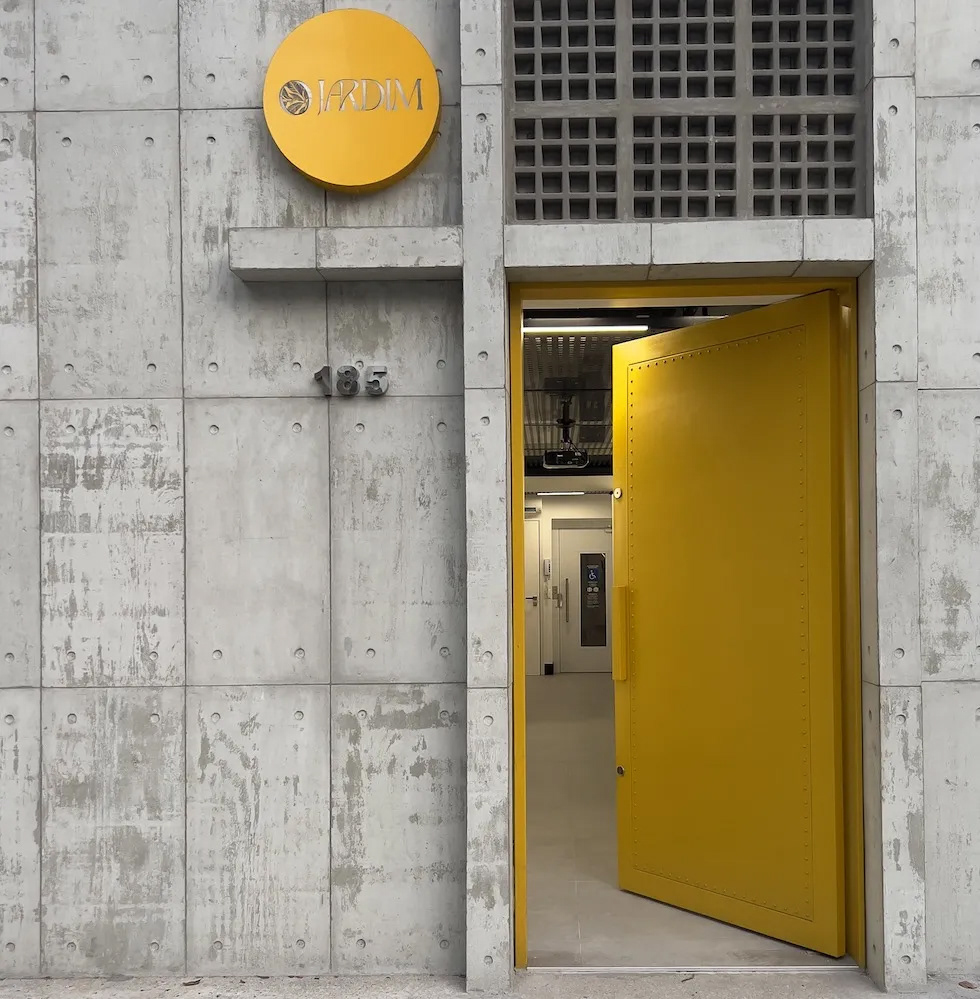
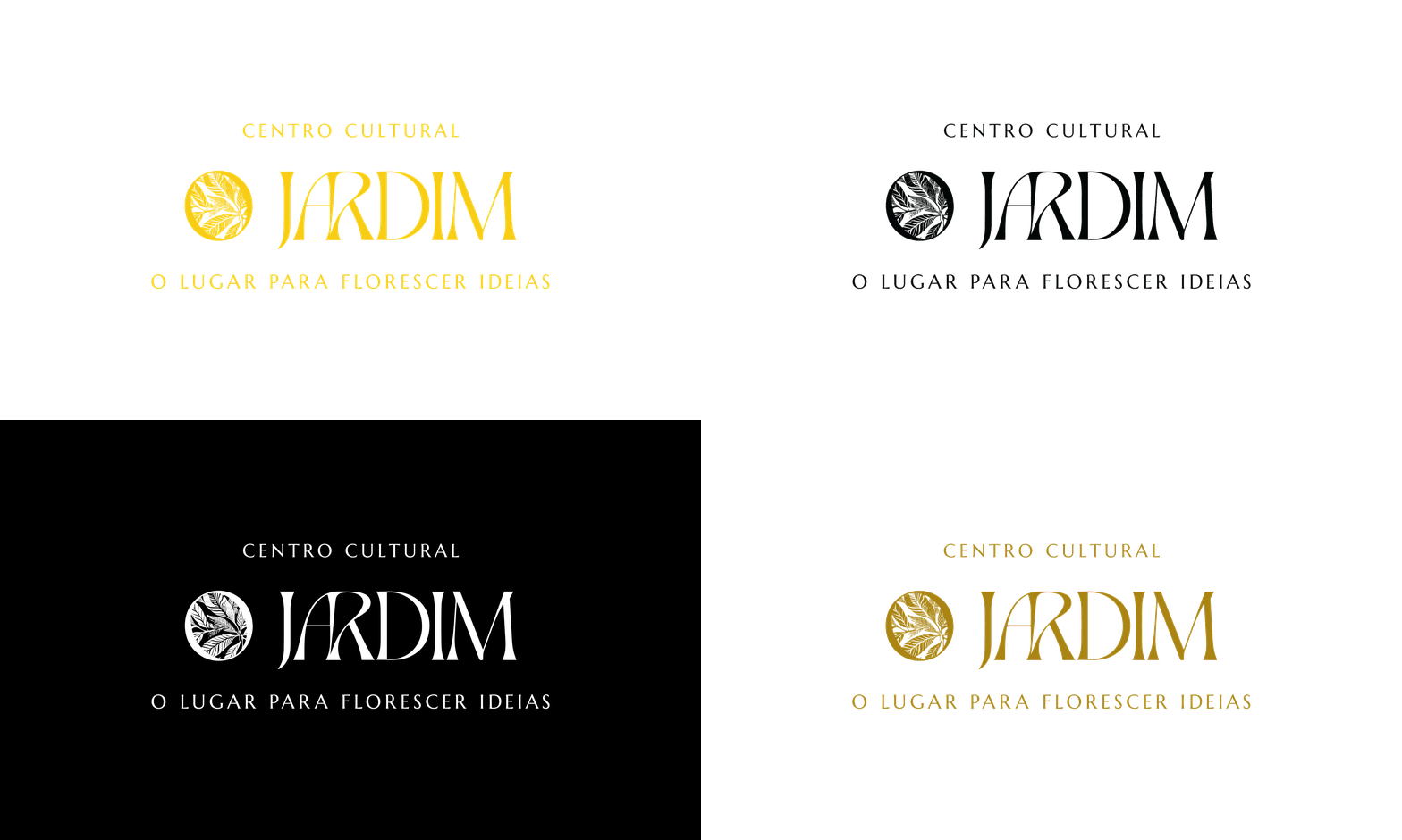
The goal was to blend elegance with organic forms, creating a visual identity that reflects both the artistic essence of the gallery and its name, which in English means “Garden”.
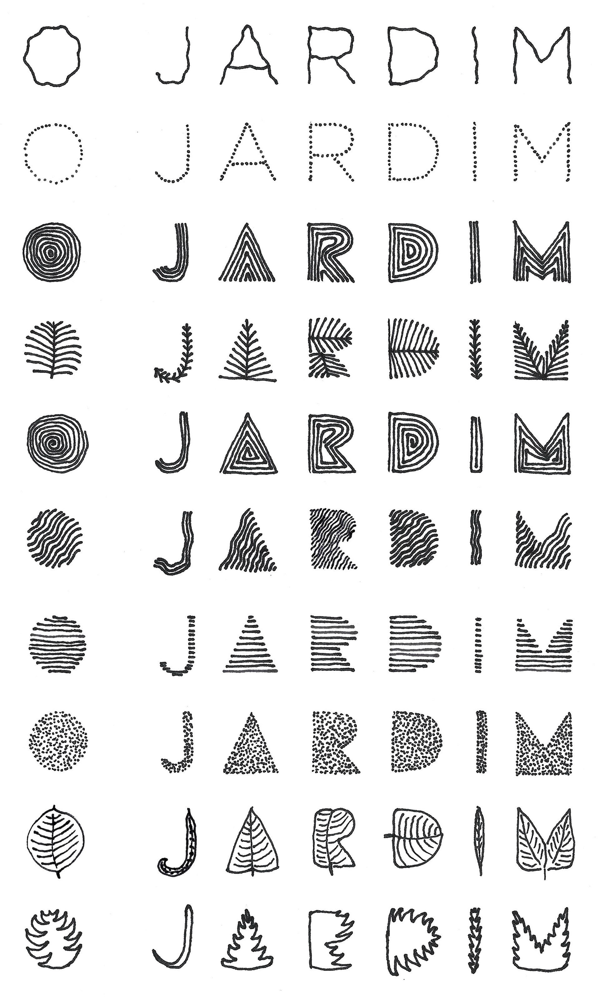
My first idea was to design each letter from scratch, bringing a handcrafted and natural aesthetic to the logotype.
Before anything else, I should confess: I tend to spend time talking about concepts that were not approved. My intention here is not only to showcase the final solution, but also to provoke a bit, test limits, ask questions — and hopefully tell a good story (fingers crossed!).
-
O objetivo era unir elegância a formas naturais, conectando o lado artístico e cultural da galeria ao seu próprio nome — que, naturalmente, remete ao jardim.
Minha primeira ideia foi desenhar todas as letras do zero, trazendo ao nome uma estética manual e orgânica.
Antes de começar, preciso confessar: eu costumo falar bastante sobre os caminhos que não foram aprovados. Minha intenção aqui não é só mostrar o final, mas provocar um pouco, testar limites, levantar perguntas — e, com sorte, contar uma boa história (tomara!).
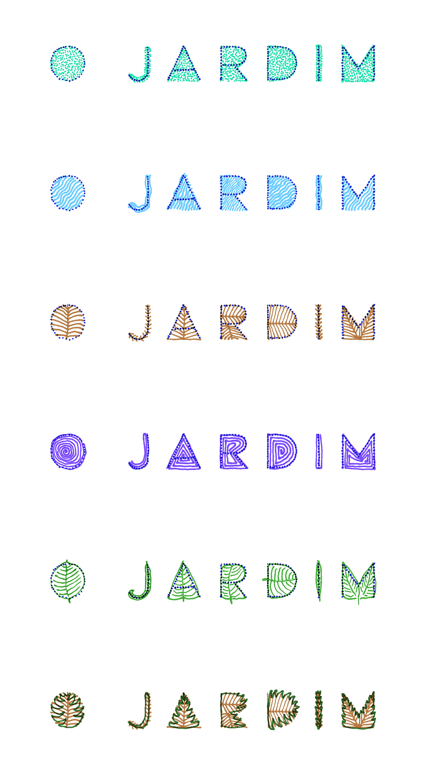
What if a brand didn’t have to be fixed?
What if a logo could shift, adapt to its environment, and evolve — just like nature does?
Maybe I was going a little too far? Time will tell.
-
E se a marca não precisasse ser fixa?
E se o logo pudesse mudar, adaptar-se ao ambiente e evoluir — como a natureza faz?
Talvez eu tenha ido longe demais? O tempo dirá.


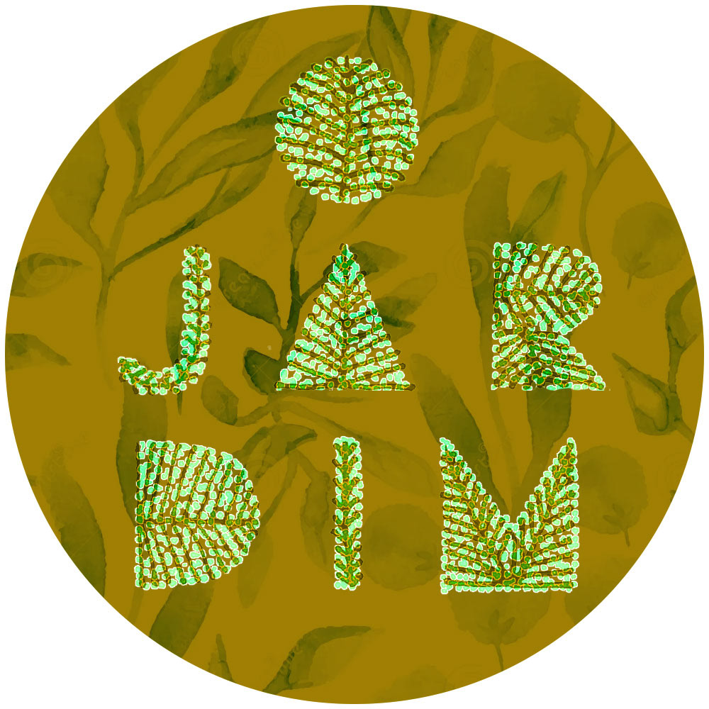
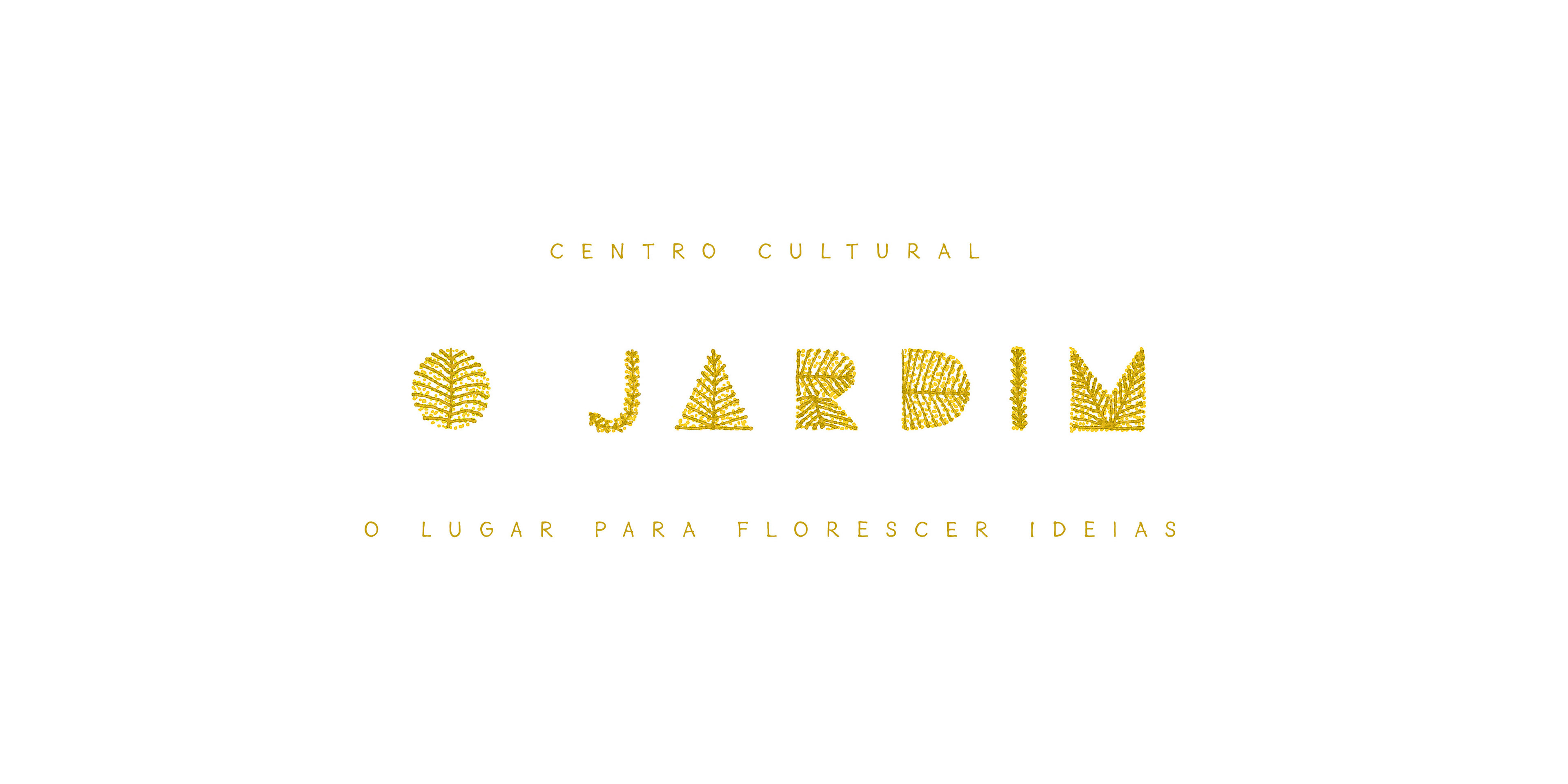
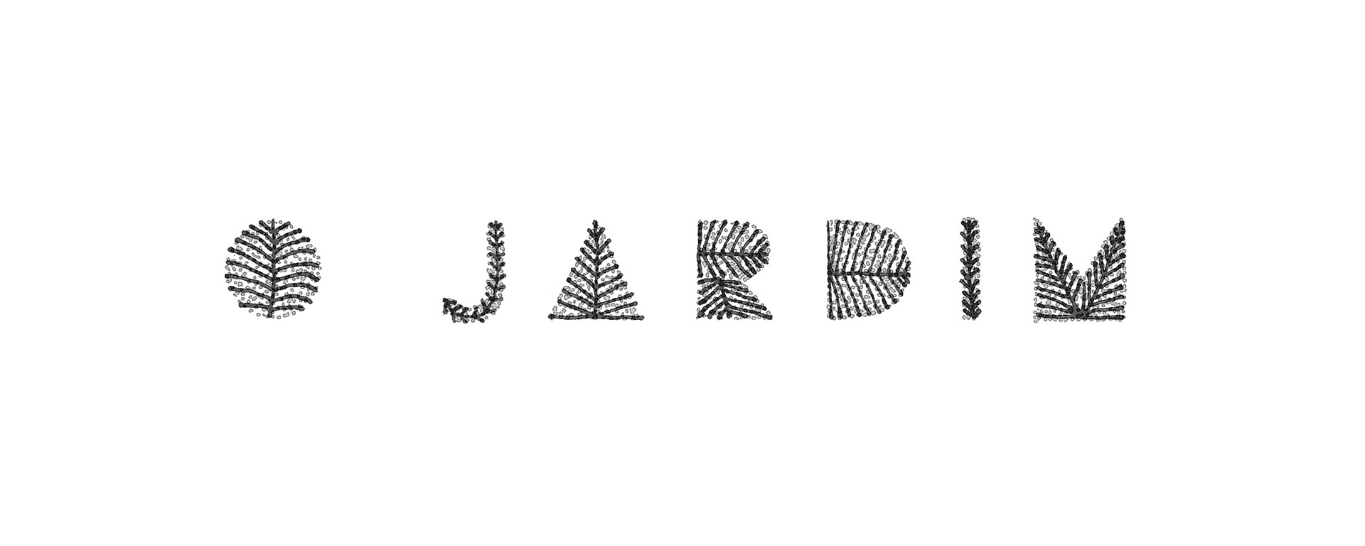
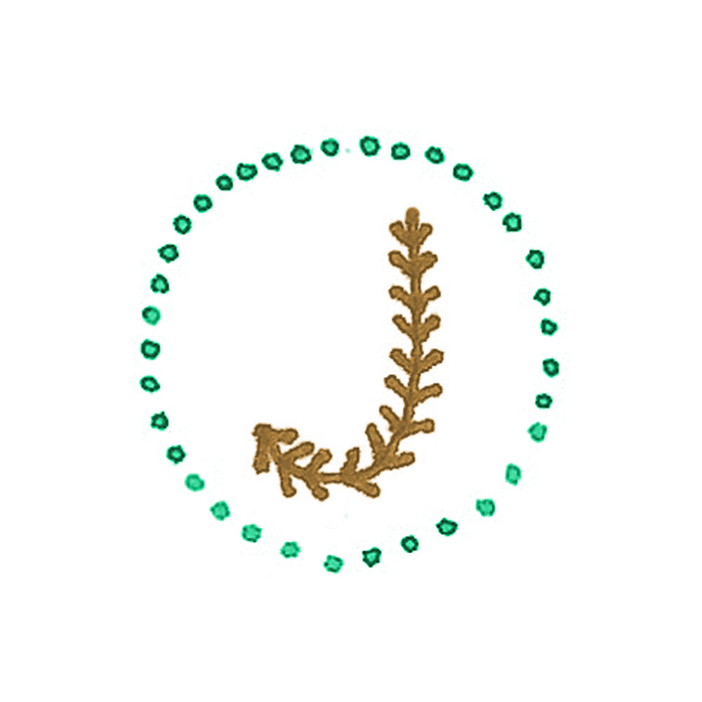
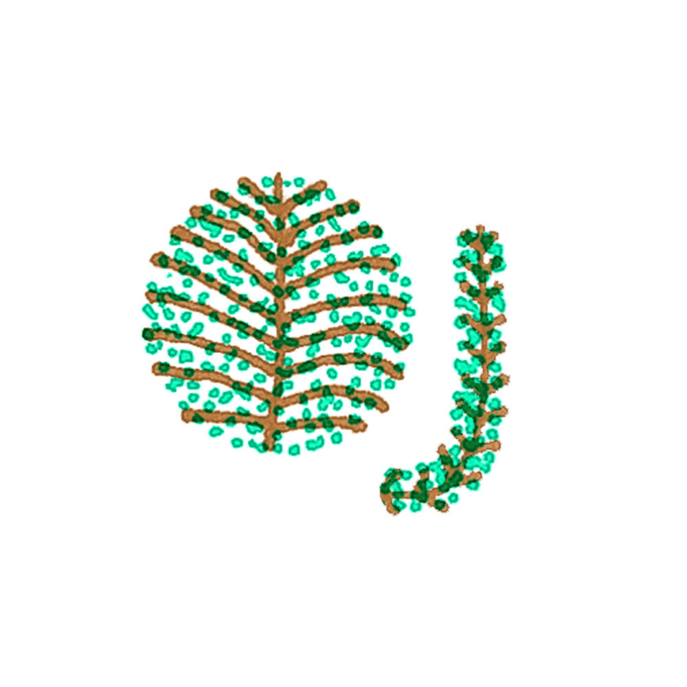
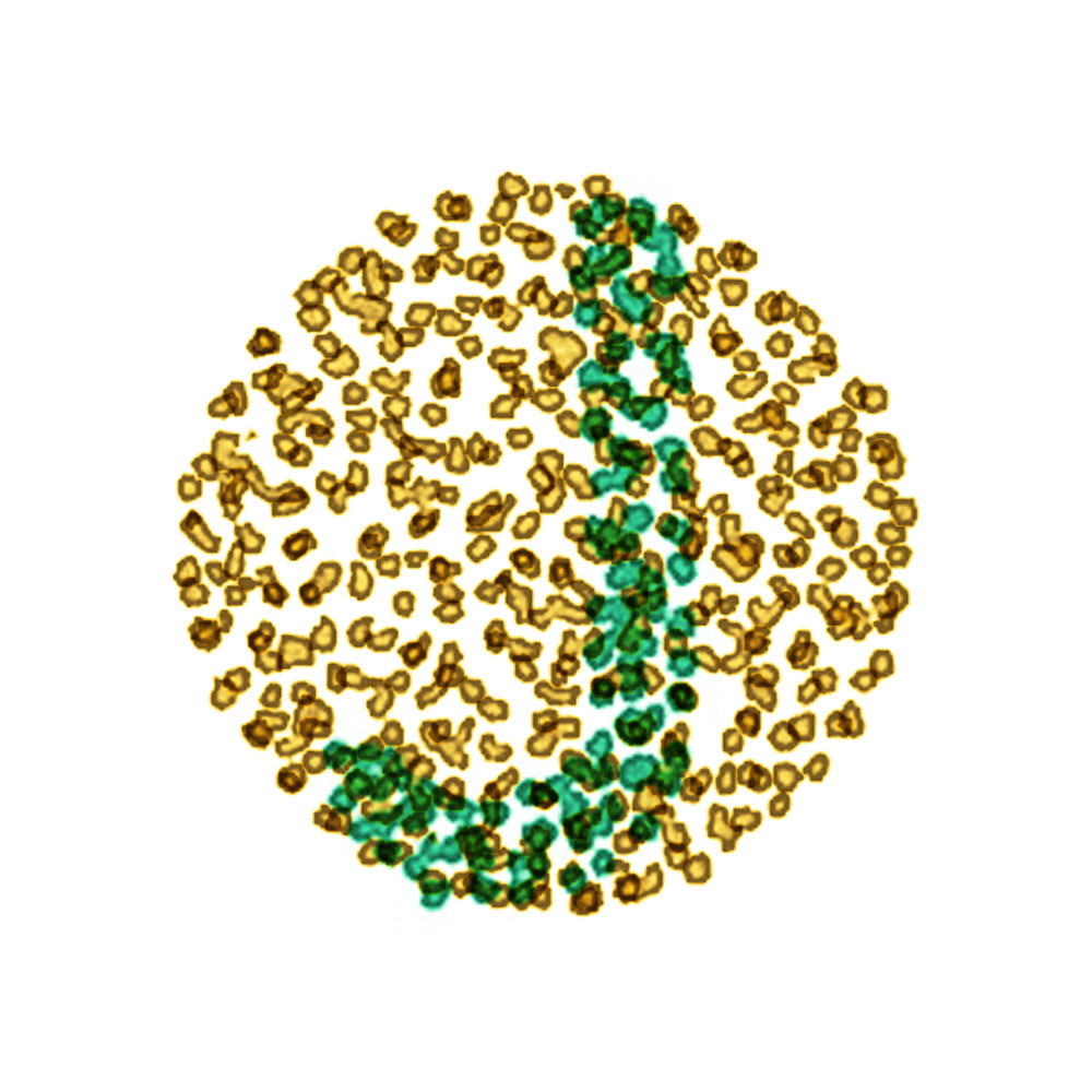
I had a great time exploring this direction, but something essential from the briefing was missing. Where was the elegance that an art gallery needs? So I began to explore new paths…
-
Me diverti muito explorando esse conceito, mas algo importante do briefing ainda faltava. Onde estava a elegância que uma galeria de arte exige? Então comecei a buscar novos caminhos…
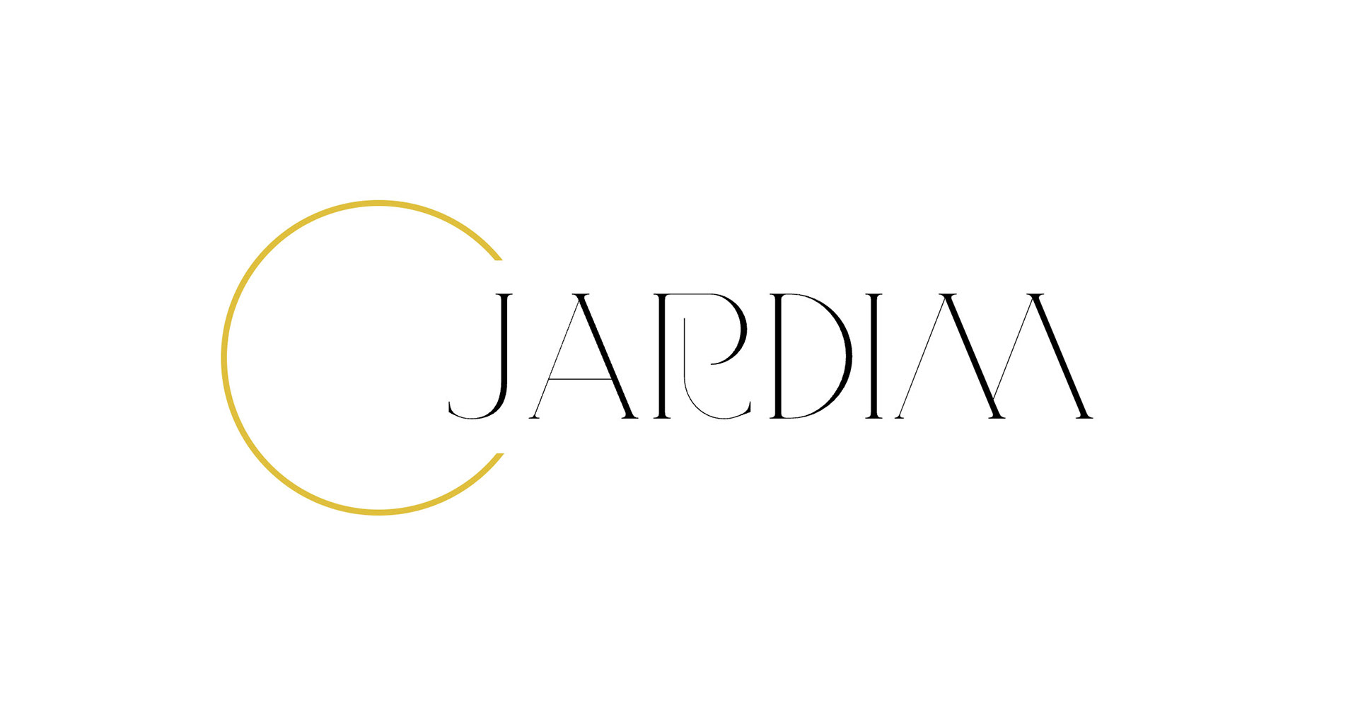
My main inspiration came from VJ-Type, an independent foundry based in Paris that creates stunning typefaces. Highly recommended, by the way.
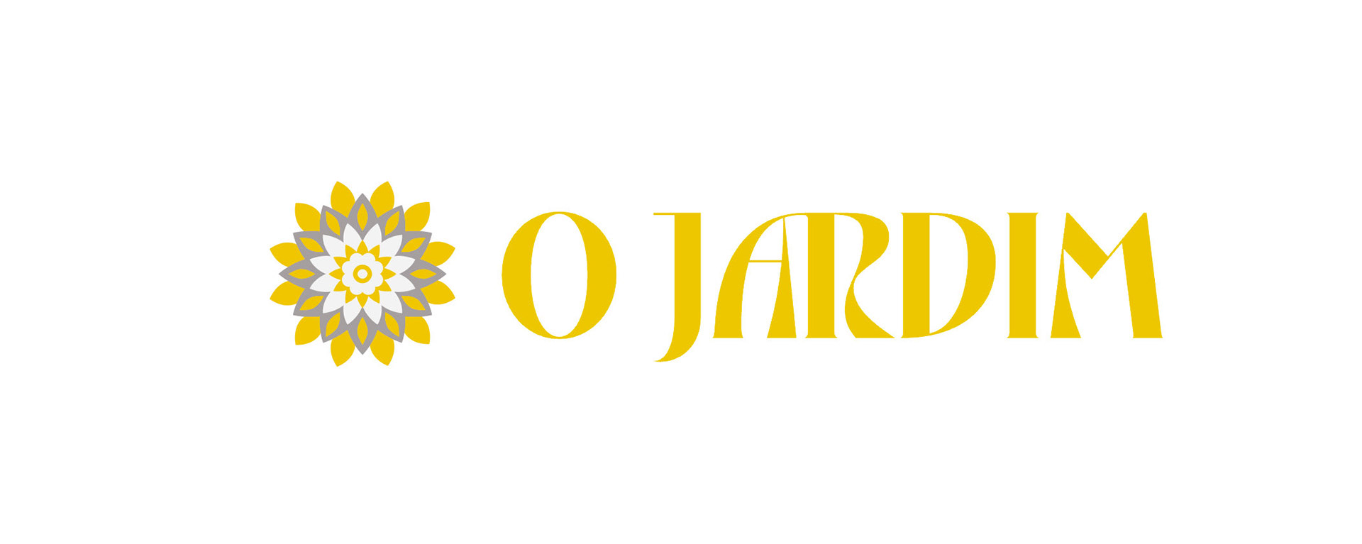
That’s when I discovered Dahlia, the typeface that ultimately shaped the logo design.
To create the leaves inside the “O”, I used AI-generated vector shapes for the first time in my design workflow. I was genuinely impressed by the creativity and choices that Illustrator’s generative tools offered. A pleasant surprise — thanks, technology!
-
Minha principal inspiração veio da VJ-Type, uma fundição independente de Paris que cria tipografias incríveis e muito bonitas. Recomendo fortemente dar uma olhada.
Foi então que encontrei a fonte Dahlia, que acabou definindo o logo final.
Para criar as folhas dentro do “O”, utilizei pela primeira vez no meu processo criativo a tão comentada IA. Fiquei genuinamente impressionado com as possibilidades de vetores gerados pelo Illustrator. Uma surpresa e tanto — valeu, tecnologia!